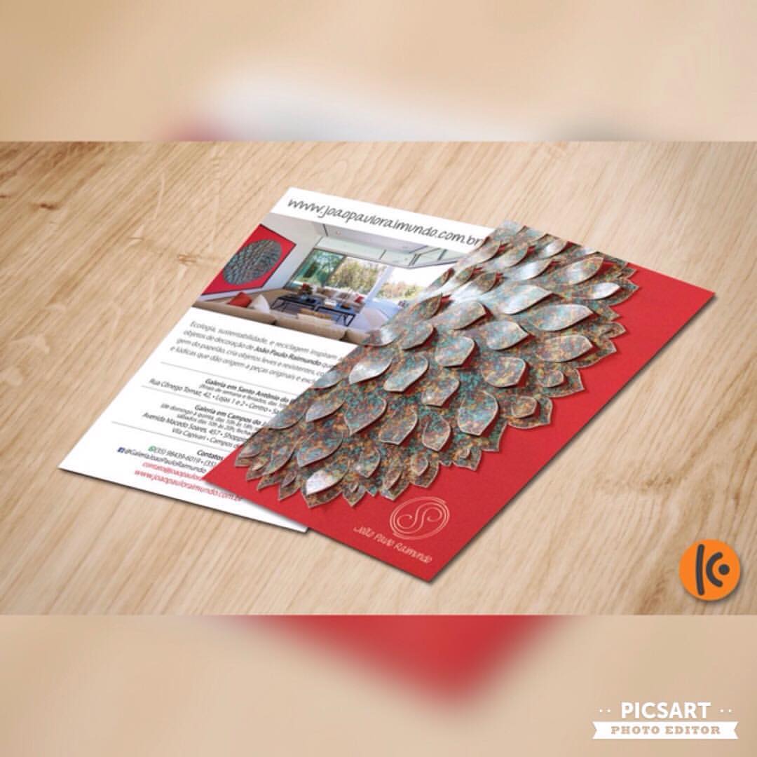
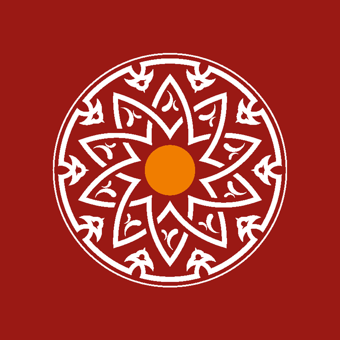
João Paulo Raimundo
Logos
Visual identity
João Paulo Raimundo
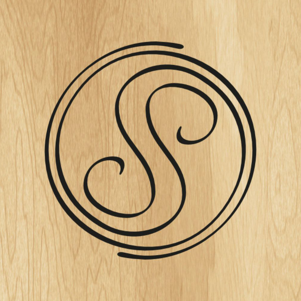
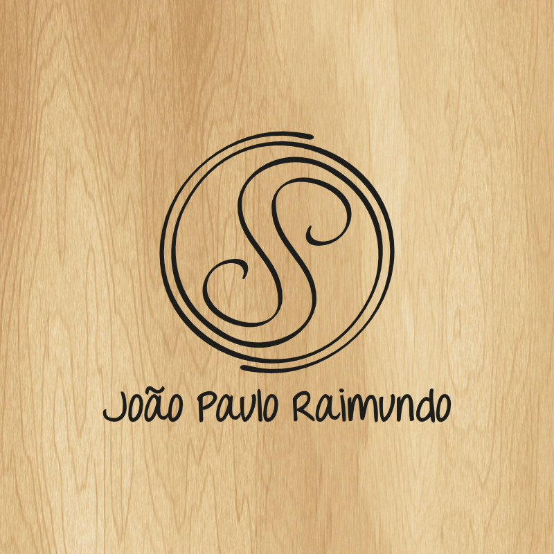
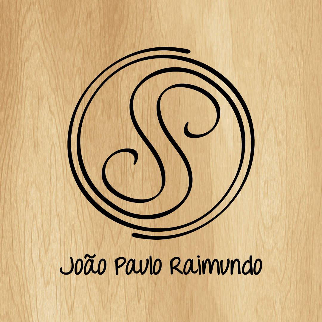
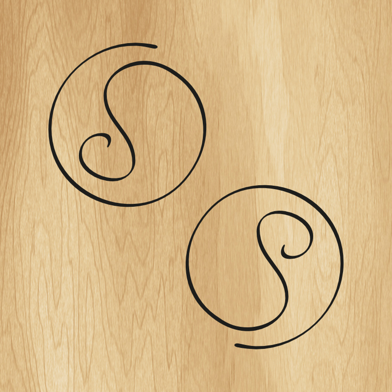
Logo for designer João Paulo Raimundo, from Maria da Fé/MG.
In creating the brand, we thought of 3 concepts: 1) A logo that resembles a mandala, the most representative piece of the artist; 2) Two stylized letters, J and P; and 3) The mandala is formed by two identical and inverted parts that complement each other, representing the harmony and complicity of the couple.
Request a quote
In creating the brand, we thought of 3 concepts: 1) A logo that resembles a mandala, the most representative piece of the artist; 2) Two stylized letters, J and P; and 3) The mandala is formed by two identical and inverted parts that complement each other, representing the harmony and complicity of the couple.
Logos
Other projects

Let's create something amazing together?
Get in touch and discover how we can turn your project into reality.
Get in touch